Sponsored Content
Features
Technology
Management
Dirty fish farm: Is the design living up to expectations?
June 14, 2020 Sponsored by by Blue Unit ![]()
Blue Unit has been invited into countless fish farms to help a frustrated fish farm manager solve poor water quality. Typically, we are forced to sleuth, using post-it notes of water quality registrations, lively descriptions of what the farmers have seen, generously peppered with finger pointing.
The fellows at Blue Unit are a peaceful mob, and as such would prefer a data-driven approach in identifying the boogie man behind a dirty fish farm.
New data-driven approach to understand RAS fish farms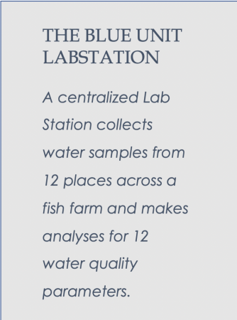
Blue Unit applies a single set of water quality sensors to an entire fish farm. This is the centralized measurement system, called the Lab Station. By using a single set of sensors, any two locations can be directly compared to each other, without sensor error disturbing the picture.
The Lab Station automatically calculates water quality gradients across fish tanks, biofilters and degassers. If a device is not operating correctly, the gradient will fall outside a threshhold.
When studying data from many Lab Stations simultaneously, Blue Unit can begin to identify challenges with certain water treatment technologies and determine the most appropriate management strategy.
The data behind this article comes from 20 individual RAS fish farms over the last nine months. In order to protect our customers’ confidentiality, we have used refined data and give no details on what water treatment technologies are used where.
Fish tank gradients
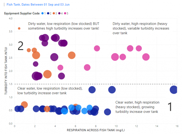
Figure 1 Respiration (mg/L) versus turbidity (NTU) to fish tanks. The size of the circle is turbidity gradient across the fish tank. Colour is Technology supplier.
Maintaining a stable fish tank environment is key to fish performance. Previously, Blue Unit has illustrated nearly 80 percent better fish growth and 25 percent reduced feed conversions in fish tanks with managed alkalinity, minimized pH drops and minimized carbon dioxide spikes.
Another important gradient is change in turbidity across fish tanks. Careless overfeeding or poor feed quality could easily act as a local boogie man to guarantee damaging turbidity spikes across the fish tank. However, by using “big data,” Blue Unit has been able to identify fish tank design as a significant “other” factor influencing fish tank performance.
Figure 1 summarizes water quality data from >40 fish tanks (one circle per fish tank). We see some important colour clusters, with colour referring to individual turnkey farm suppliers.
Moving right along the x-axis, the respiration intensity in the fish tank grows. Moving upwards along the y-axis, the turbidity entering from the water treatment system grows. The larger the circle, the greater the turbidity increase across the fish tank.
In the lower zone of Figure 1 (1) the fish farm water in general is clean. We see some relations between respiration intensity and turbidity increase across the fish tank. This is to be expected – with greater respiration intensity, expect more faeces and higher outlet turbidites.
In the upper zone of Figure 1 (2) the fish farm water is dirtier. We notice some fish tanks with low respiration intensity, but high turbidity increases (large circles). The low respiration indicates lower stocking (less faeces), while a large turbidity increase indicates elevated smashing of faeces to form fine colloidal particles. Could this be the ugly head of a boogie man? Let us see what happens when this water passes through drum filters and biofilters.
Biofilter gradients
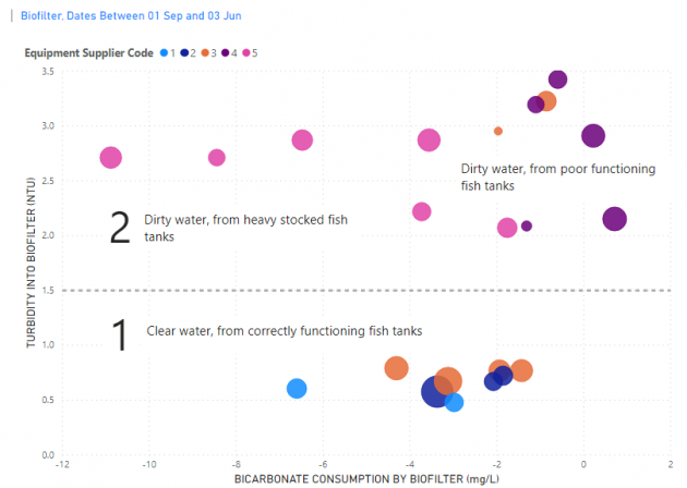
Figure 2 Bicarbonate consumption (mg/L) versus turbidity (NTU) entering biofilters. Size of the circle is turbidity gradient across the biofilter. Colour is Technology supplier.
Water leaving fish tanks passes through drum filters and to biofilters. Blue Unit normally measures after the biofilter, to capture key water quality gradients. Biofilters can be of various designs – Blue Unit measures on three different types of biofilter: fixed bed with air, fixed bed without air and moving bed.
In Figure 2, moving left along the x-axis, the consumption of bicarbonate by the biofilter increases. The biofilters to the left are better performing in terms of nitrification (ammonia removal). Moving upwards along the y-axis, the turbidity of water from the fish tanks increase.
The circle’s size indicates the change in fine colloids between the fish tanks and the biofilter outlet. The drum filter is not necessarily playing a role here as we are focusing on the fine colloids that pass drum filters and become trapped in the biofilter.
The small circles are the biofilters that are trapping a lot of fine colloids, while the large circles are biofilters losing their colloids.
Biofilters inhabiting the lower zone of Figure 2 (1), receive clear water from correctly functioning fish tanks. These biofilters typically are better oxygenated and experience better nitrification due to less overload of fine colloids.
The biofilters inhabiting the upper zone of Figure 2 (2), receive water from either heavily stocked fish tanks or from poor functioning fish tanks, heavy in colloids. In some of these biofilters we see decreasing bicarbonate consumptions (a shift from healthy nitrification towards oxygen consuming/carbon dioxide producing heterotrophic bacteria).
Generation of fine colloids in fish tanks that are small enough to pass through drum filters has a damaging effect on biofilter nitrification performance. By looking at the clustering of biofilter colours (turnkey farm suppliers), it seems also that biofilter design and management (or lack thereof) play a role in nitrification and colloid accumulation. Technology supplier 4 biofilters (purple), received similar overloads of fine colloids, but one of these filters was very good at capturing the colloids (small circle). Two of these biofilters caught small amounts of colloids, while two biofilters experienced so much heterotrophic growth (large circles) that new particles were being created and lost out of the filter. The next question is what happens if you fill your degasser up with colloids?
Degasser gradients
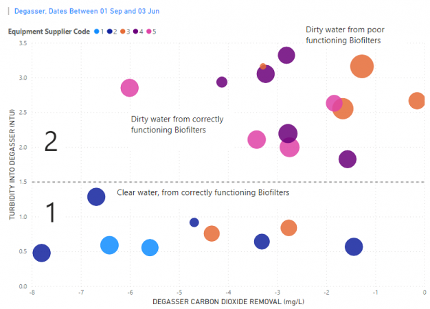
Figure 3 Degasser CO2 Removal (mg/L) versus Turbidity (NTU) entering degasser. Size of circle is turbidity gradient across the degasser. Colour is Technology supplier.
Water leaving biofilters flow to their respective degasser. Blue Unit measures three different types of degassers: trickling type with strong negative air pressure, trickling type with light positive air pressure and aeration chambers. Figure 3 shows degasser performance when incoming water is from biofilters of varying character.
In Figure 3, moving left along the x-axis, the degasser carbon dioxide (CO2) removal increases. This means degassers to the left are better performing in terms of CO2 removal. Moving upwards along the y-axis, the turbidity of water from the biofilters increase.
The circle’s size indicates the change in fine colloids between the biofilter and the degasser outlet. The small circles are the degassers that are trapping a lot of colloids, while the large circles are not trapping colloids. Degasser performance is made interesting by the fact that the colours (turnkey farm suppliers), are less clustered. This suggests that different degasser designs are impacted at varying degrees by colloids.
Consider technology supplier 4 (purple). The water quality leaving these biofilters had the highest colloid levels, and so we would expect these degassers to perform the worst in terms of CO2 removal. Colloids can result in large biofilms on degasser surfaces. Biofilms can damage not only the physical operation of a degasser but can consume oxygen/add CO2 to the water. However, in this case, another degasser design (orange colour), was strongly impacted by colloids, awarding itself the rotten tomato.
Conclusion
By aggregating vast amounts of data, we have clearly illustrated how data is used to understand water quality and performance of fish farm tanks and filtration systems. Design problems can be compensated for as long as management receives the right data to avoid catastrophes. The Blue Unit Lab Station is the data driven means of discovering if the boogie man is packing up to leave – or moving in permanently.
Print this page